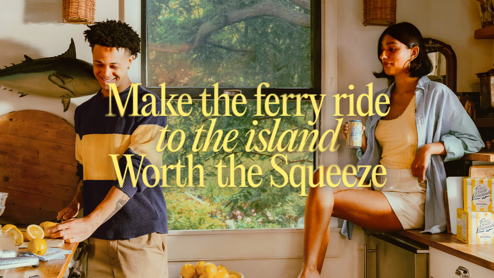
I contributed across design, led photo and video editing, and developed the motion system. I began by researching the brand and the island’s histories, which directly informed the typography system, motion behaviors, and the photo and video art direction, which were the core areas I led.
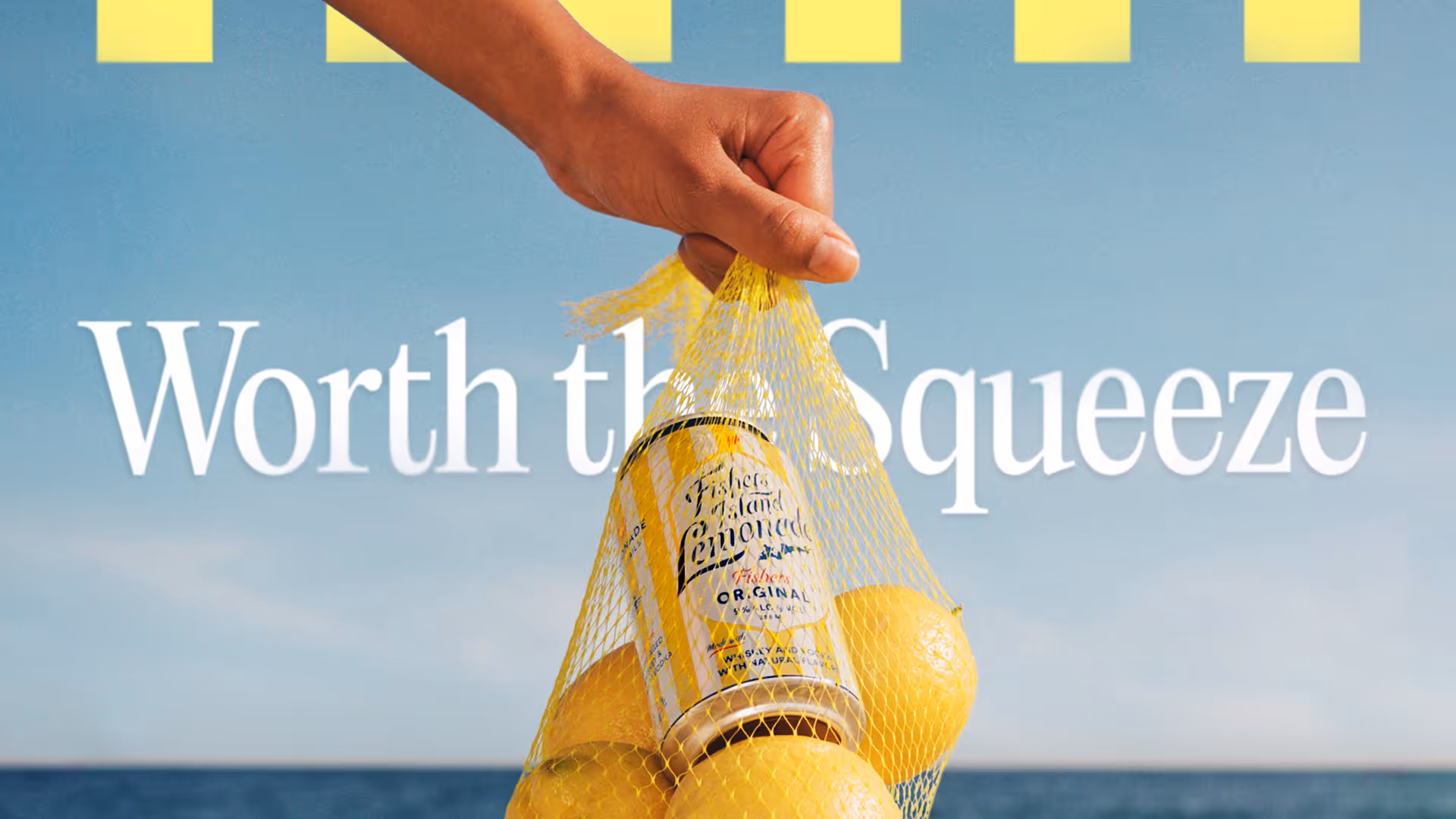
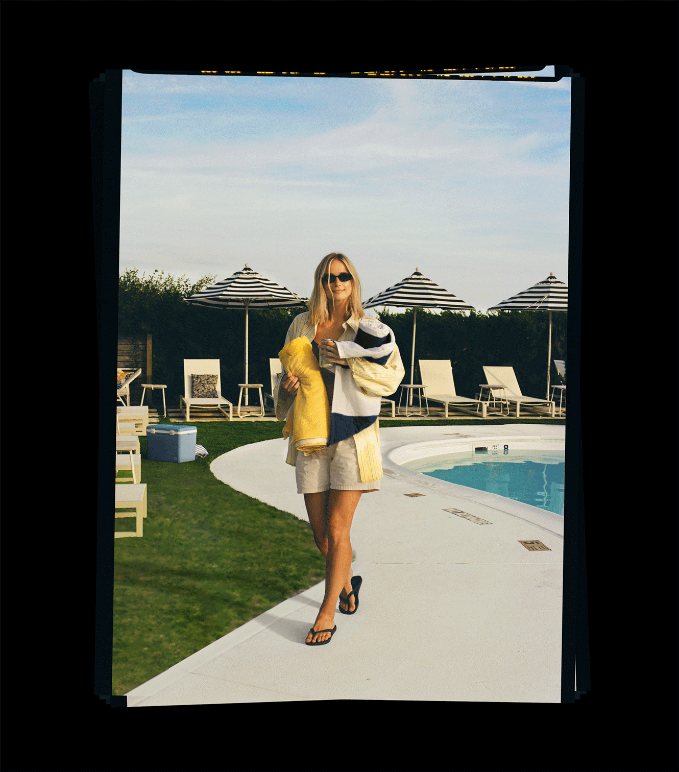
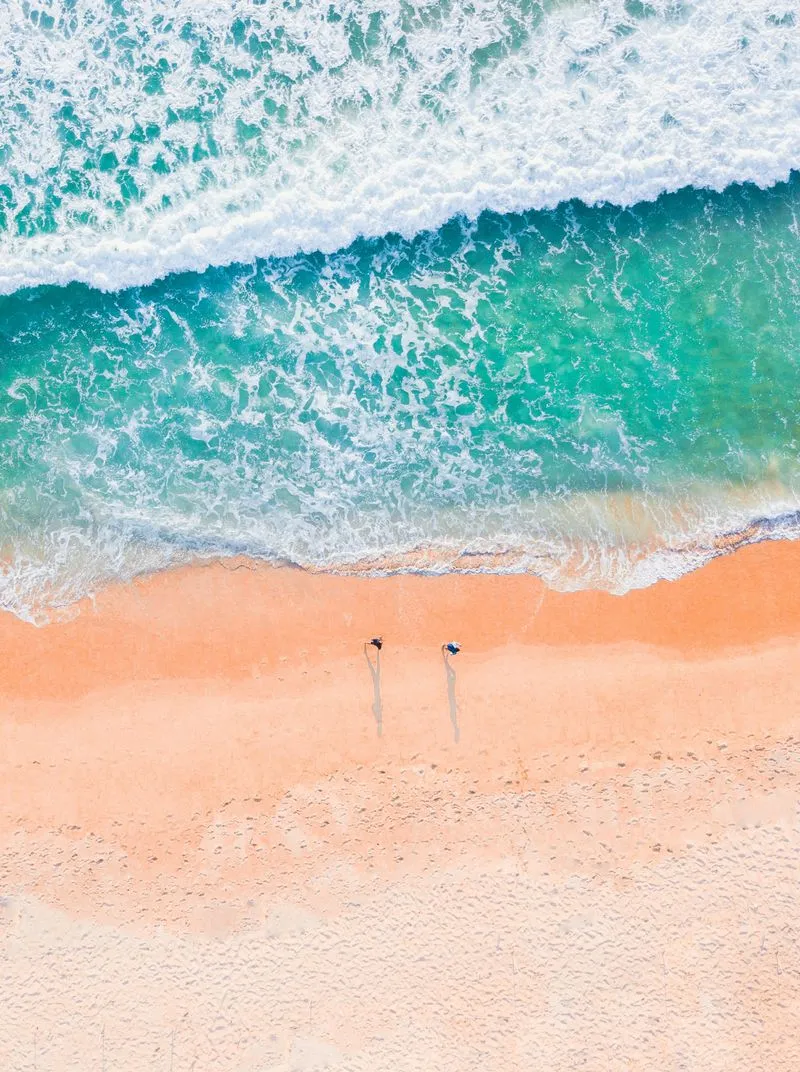
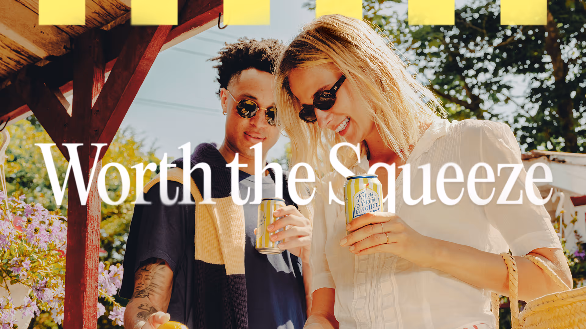
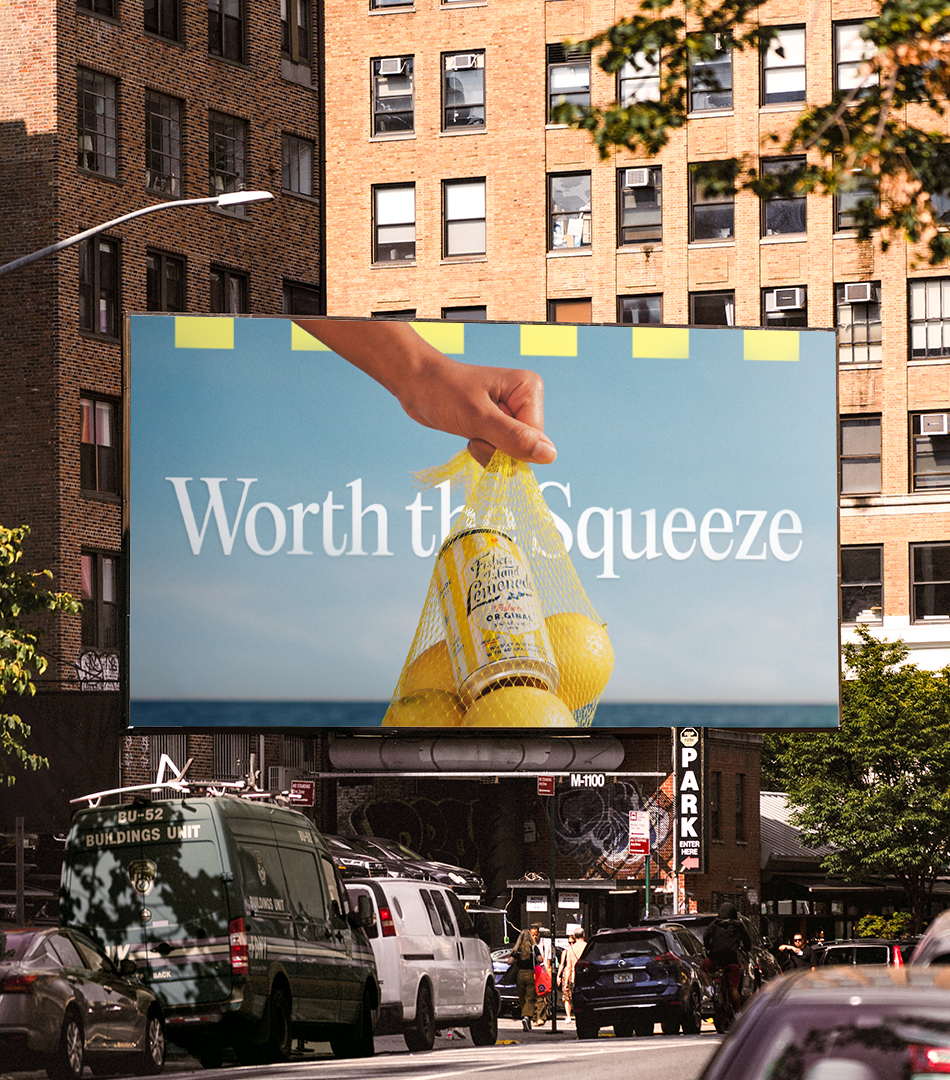
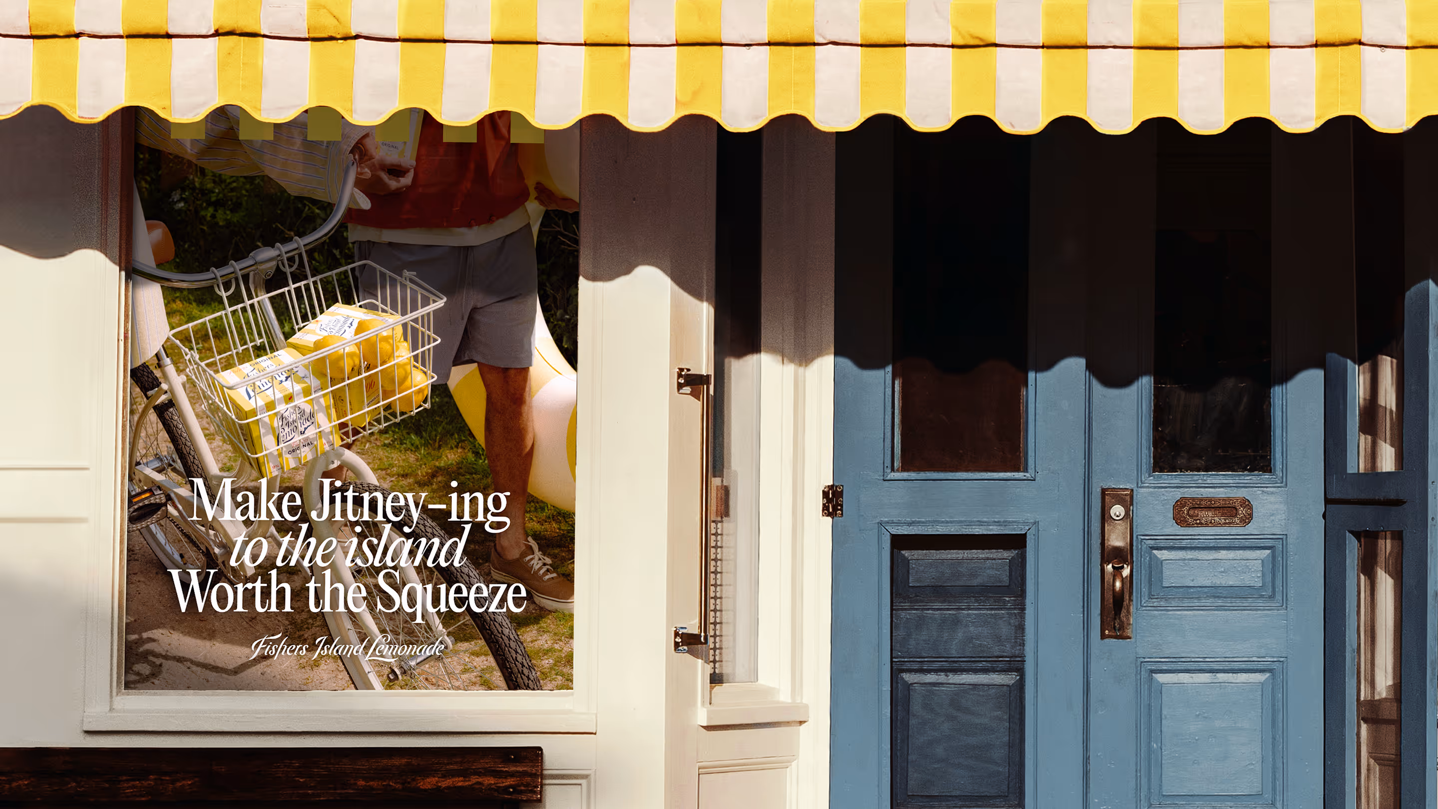
Why— Fishers Island Lemonade is inspired by the idyllic island destination, Fisher's Island, but the identity wasn’t bringing that feeling to life. The brand relied heavily on functional messaging and blended into the category. Without changing the packaging, the opportunity was to build a visual world around the product that reflected the Fishers Island state of mind.
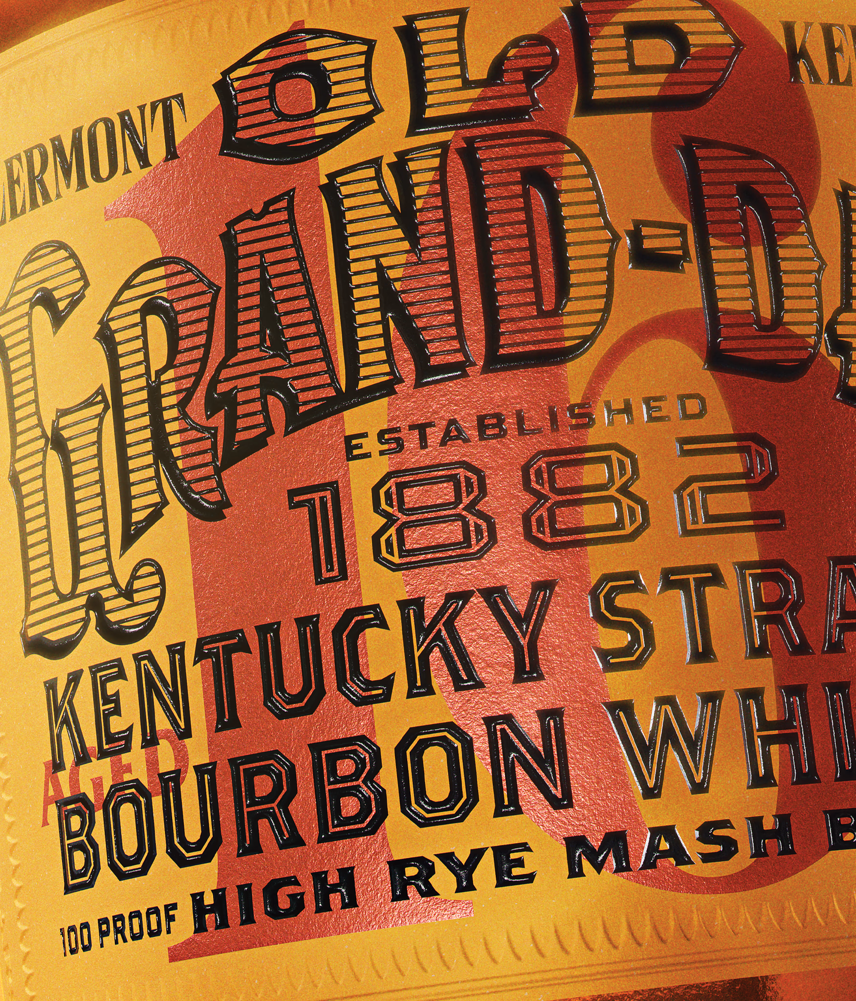
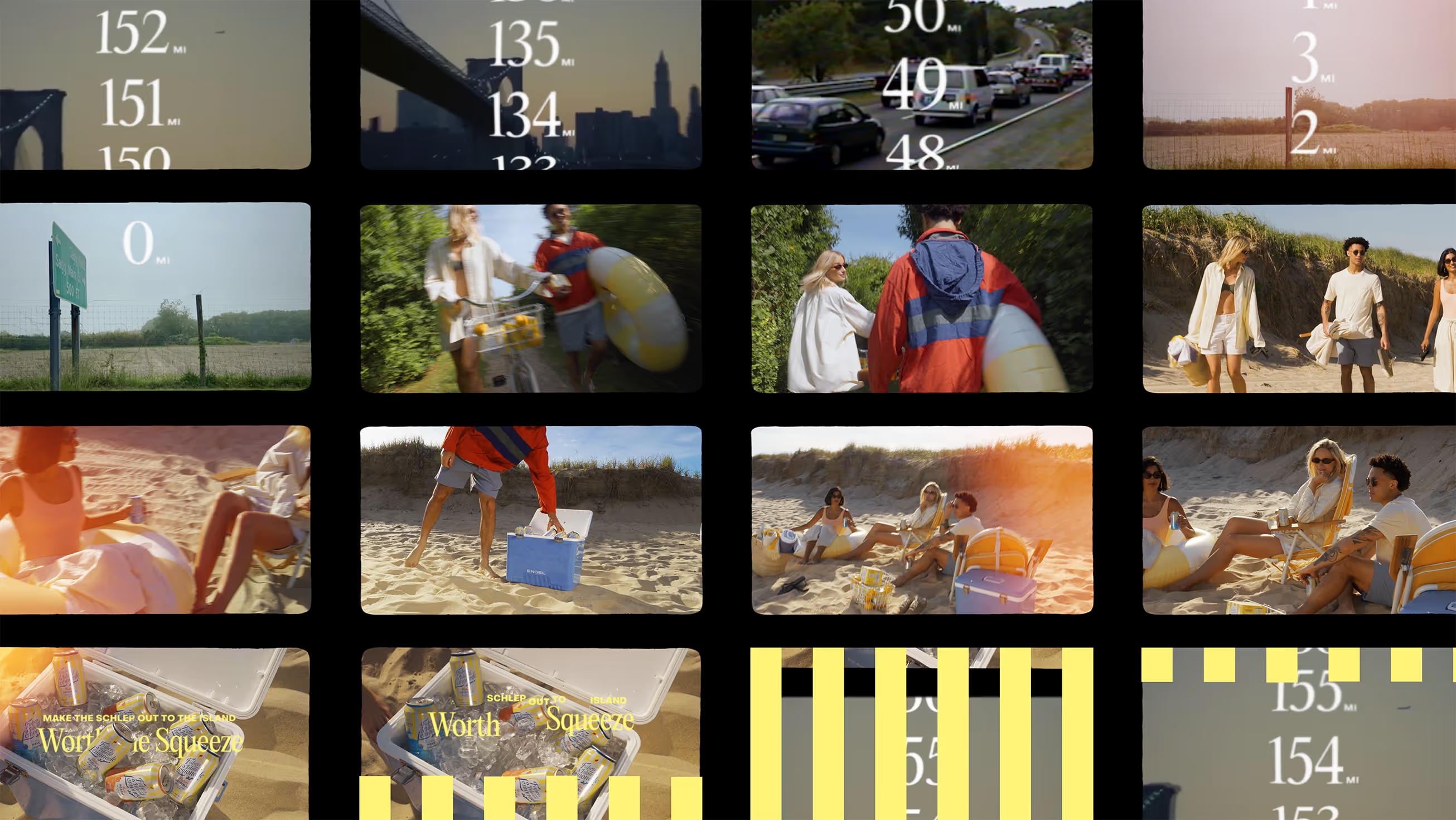
How— The system pulls from the era when weekend escapes to the island were flourishing, reflected in the fashion, typography, and film photography. Every touch point was treated as a frame from a weekend trip to the island shot on a Super 8. Photography focused on shared moments among friends, with cans naturally embedded in the scene. Existing brand equities, like the six yellow stripes, pull from the packaging and the island’s umbrellas and create subtle anchors across the system.
Get in touch
Recognized by
PRINT Awards 2025, Brand Collabs, First
DIELINE Awards 2025 Packaging, Second
Creativepool Annual 2025 Designer, Shortlist
Creativepool Annual 2025 Packaging, Bronze
Creativepool Annual 2025 Packaging, Bronze
AdAge Marketing Winner of the Week
Craft Beer Marketing Awards 2022, Platinum
AAF Addy Awards 2020 Logo Design, Gold
For whom
AB InBev, Campari, Chick-fil-A, Gallo, New York City F.C., TIME Magazine, Station Casinos, Suntory, Virgin Hotels, Waldorf Astoria Hotels, Westin Hotels, Wynn Resorts

Recognized by
Alongside
(Tavern) Mike Perry, Creative Director + Kevin Davis, Design Director + Vin Conti, Designer + Will Simmons, Designer, Motion Designer + Cole Wilson, Photographer + Lisa Franck, Strategist + Jenna Portela, Head of Client Services & Growth + Lauren Greenspan, Account Coordinator + (Gallo) Liz Tomic + Steph Bernard + Talia Shalen + Katie Coco