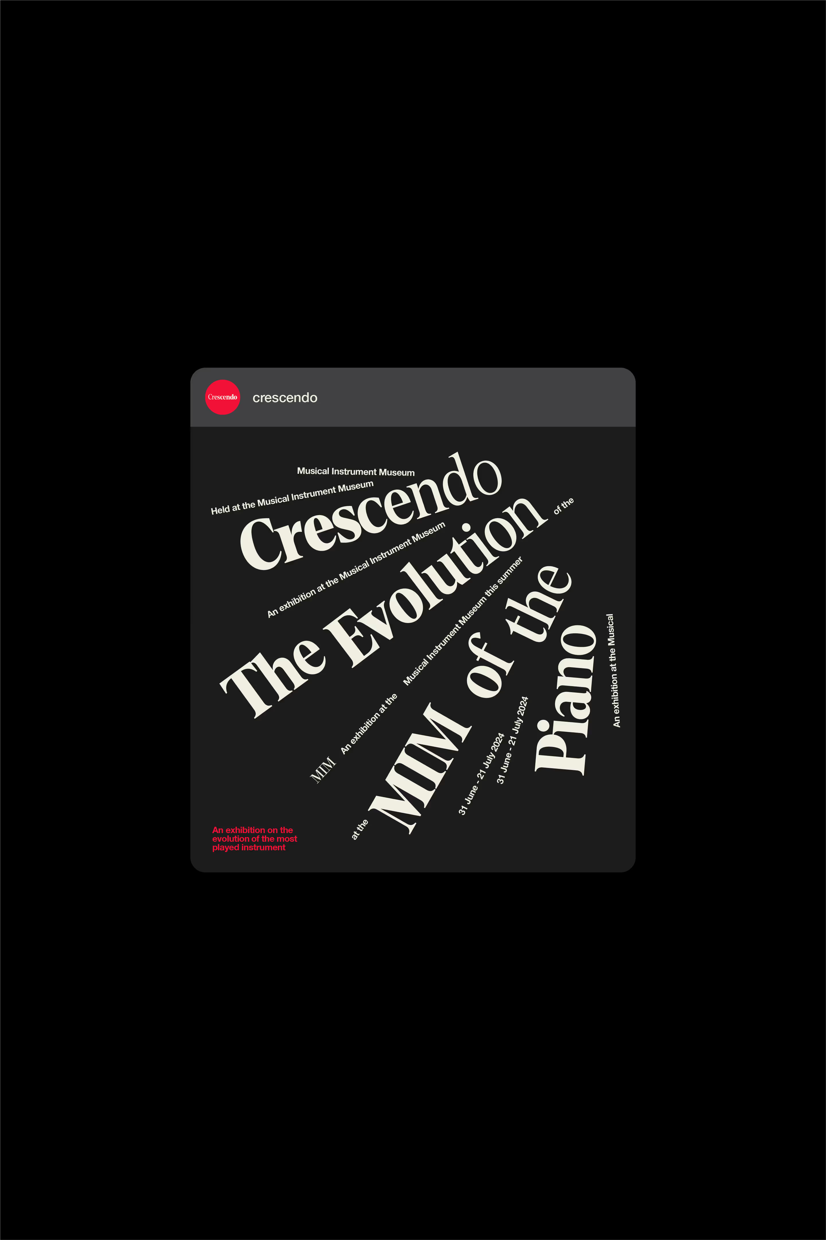
I led the project end to end, from naming and strategy through full identity design and motion. I also created the interactive promotional tool to extend the system beyond static applications.
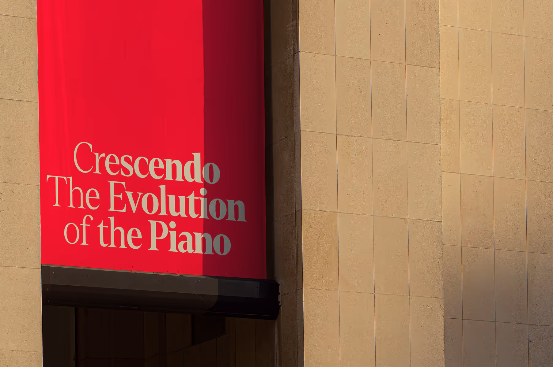
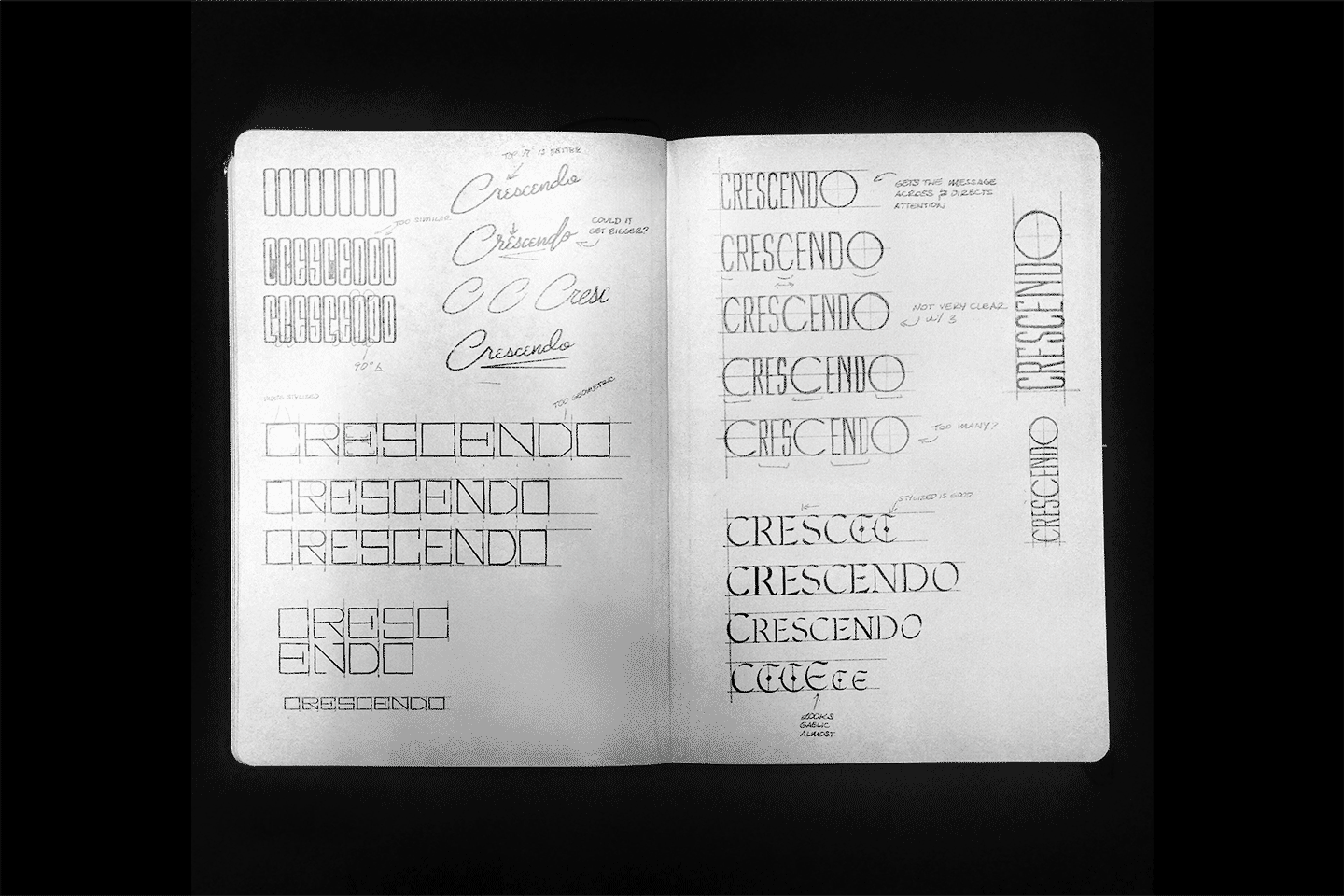
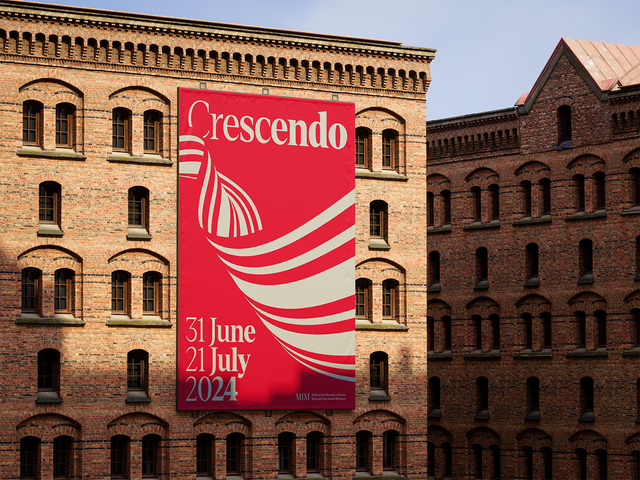
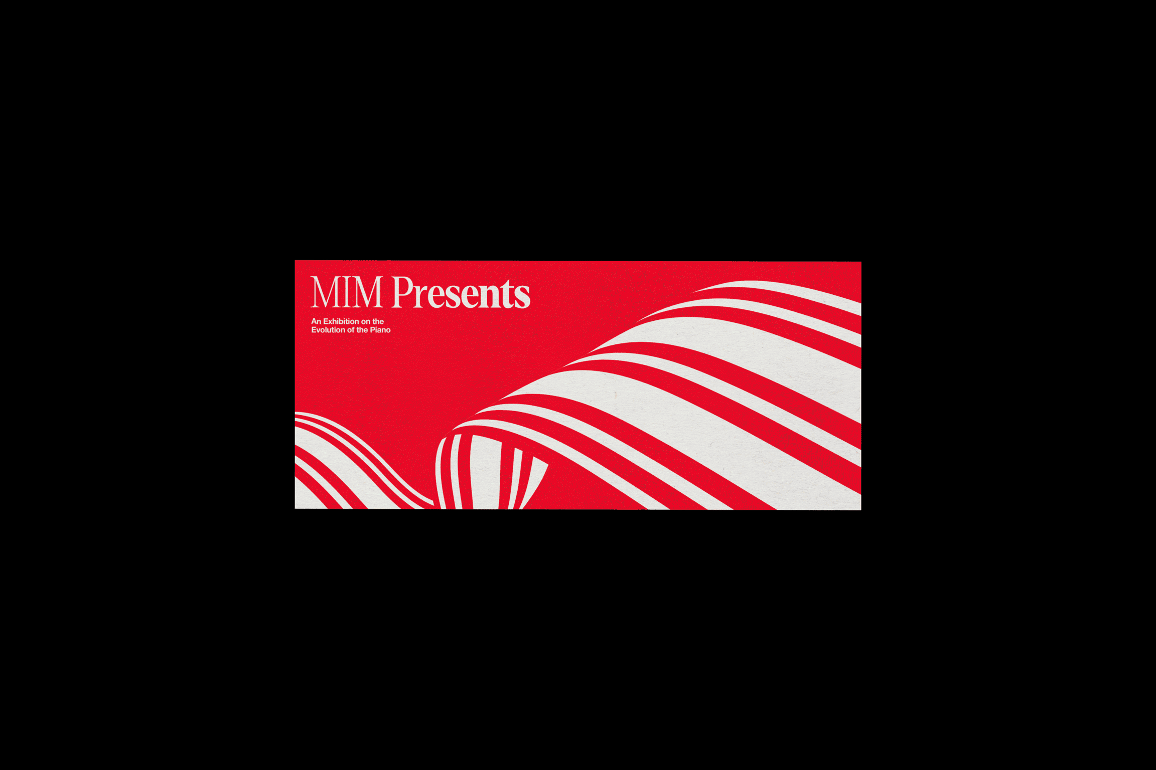
Why— I was inspired by an exhibition I saw in the Musical Instrument Museum in Phoenix, Arizona on keyed instruments and wanted to build an identity around that. It needed to illustrate the piano’s innovative past and future. It also needed to encourage audience participation, something that helped the piano become the most played instrument in the world, its accessibility.
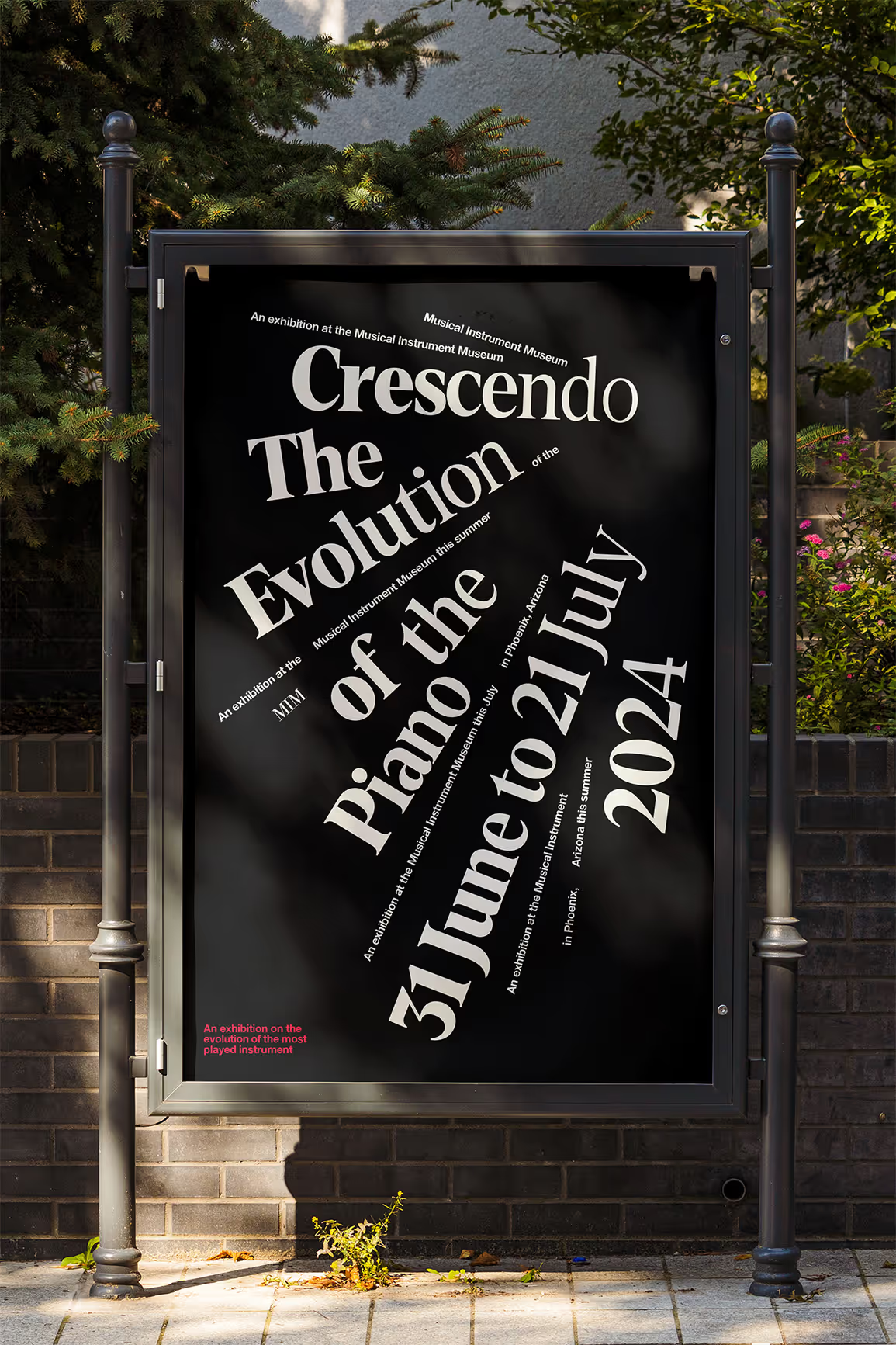
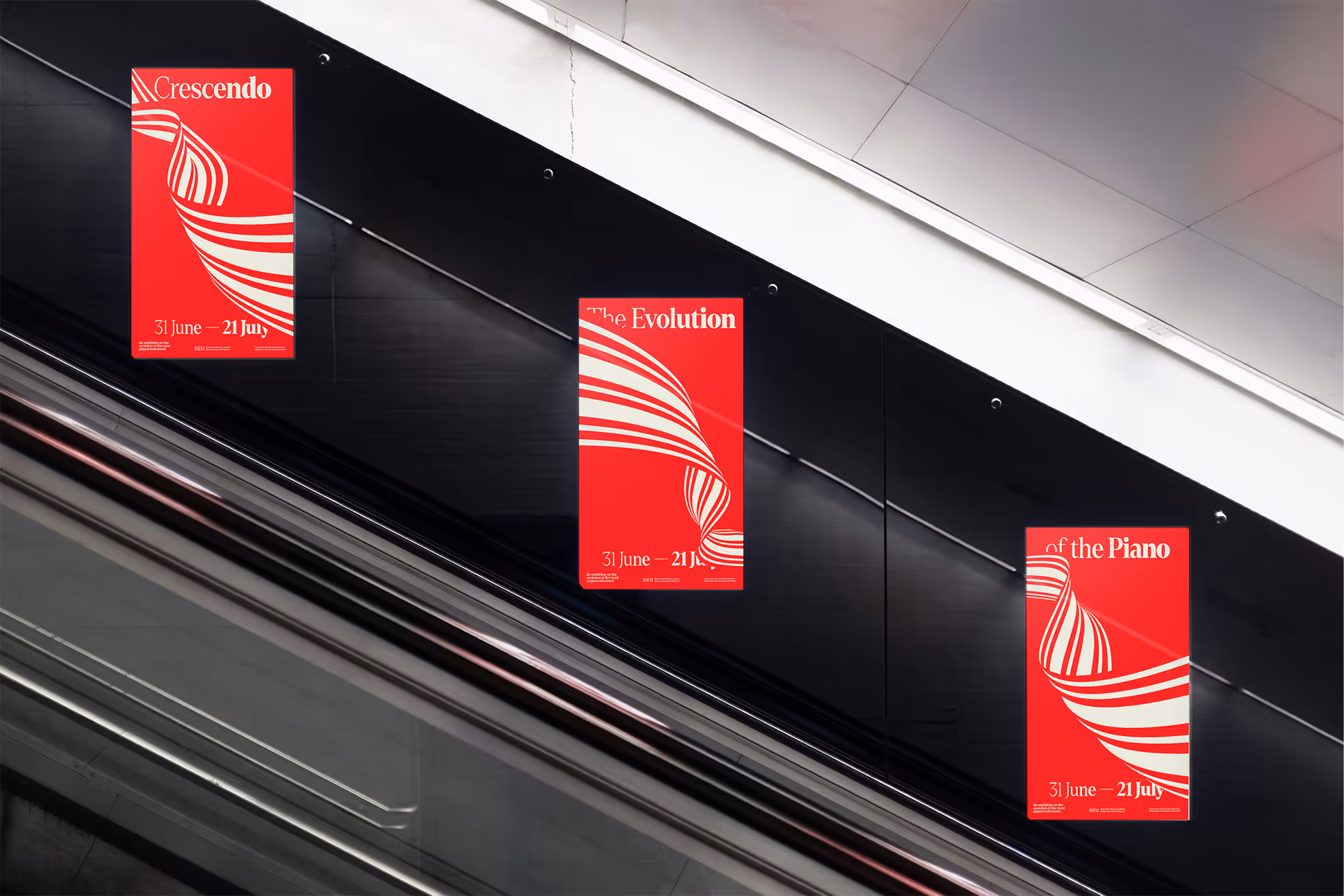
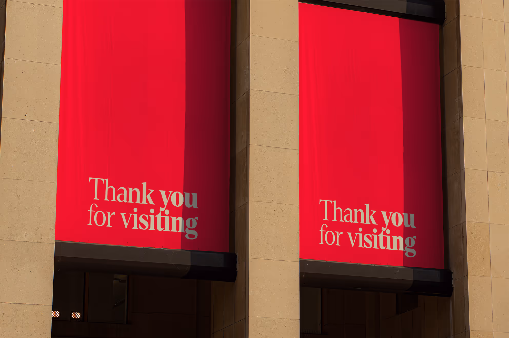
How— The identity centers on the piano’s defining innovation: its ability to shift in volume and intensity — to crescendo. Typography becomes the primary storytelling device, with headlines that visually transition from restrained to bold, embodying shifts in sound. The typeface draws from expressive early 20th-century titling, reinforcing the exhibition’s dialogue between heritage and modern relevance. The color palette references the instrument’s material origins, deep ebony, ivory keys, and red felt. Animated piano “ribbons” violate layouts, introducing motion as a core brand element. An interactive promotional tool extends the identity beyond the exhibition space, inviting audiences to engage with the instrument.
Get in touch
Recognized by
PRINT Awards 2025, Brand Collabs, First
DIELINE Awards 2025 Packaging, Second
Creativepool Annual 2025 Designer, Shortlist
Creativepool Annual 2025 Packaging, Bronze
Creativepool Annual 2025 Packaging, Bronze
AdAge Marketing Winner of the Week
Craft Beer Marketing Awards 2022, Platinum
AAF Addy Awards 2020 Logo Design, Gold
For whom
AB InBev, Campari, Chick-fil-A, Gallo, New York City F.C., TIME Magazine, Station Casinos, Suntory, Virgin Hotels, Waldorf Astoria Hotels, Westin Hotels, Wynn Resorts


Alongside
(Self-initiated) Will Simmons, Creative Director, Designer, Motion Designer